Magazine Cover Sketch
- shiraavidan77
- Jan 24, 2023
- 2 min read
Updated: Mar 23, 2023
Over the past few weeks, my class and I have been thoroughly researching and studying magazine covers, including their codes, conventions, and typography. As a result, my class and I applied our knowledge gained from the previous assignments this week to brainstorm ideas for the front cover of our magazine. Then, we sketched and colored our front cover draft, ensuring that we incorporated the proper elements, such as a masthead, barcode, dateline, main image, cover lines, cover palette, etc.
The images below are the digital and print versions of my magazine cover sketch, representing how I may want my final magazine cover to look. First, I created the sketch on Google Slides as I thought it would make producing the drawn cover sketch much easier. After all, I have years of experience with Google Slides, and I think it is very easy to use! Then, with the exception of a few changes, I replicated the digital sketch on a piece of paper.


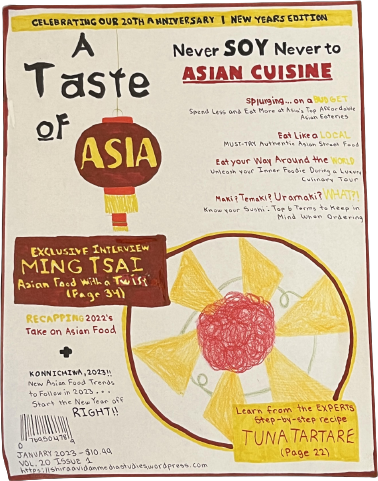
After thoughtful consideration, I decided to draw an image of tuna tartare, a well-known Asian appetizer that I believe will look appealing on my front cover. Plus, this dish is often plated nicely, hence why I thought it would act as a perfect MAIN IMAGE.
I decided to implement the following three colors as my COLOR PALETTE: red, yellow, and black. Often associated with and symbolized in Asian customs and beliefs, these specific colors truly signify/connote Asian culture. These colors are vibrant and bold, meaning they help easily draw attention to certain elements in my magazine.
I decided to make my MASTHEAD bold and relatively big to draw my readers' attention; in this case, it takes up about a quarter of the page.
I decided to use ANCHORAGE TEXT to point out what is shown in my main image for those unaware of the dish.
I placed a SLOGAN near my masthead ("Never Soy Never to Asian Cuisine"), which helps further promote/advertise my magazine's services.
The red border and masthead typography would be a significant part of my magazine's HOUSE STYLE: they would be present in all "A Taste of Asia" issues.
The word "exclusive" acts as a BUZZWORD as it demonstrates to the readers that the interview is not published anywhere else, convincing them to purchase the magazine to not miss out.


Comments