Double-Page Spread Research
- shiraavidan77
- Feb 24, 2023
- 9 min read
Updated: Mar 24, 2023
This week, my class and I started researching double-page spreads from our genre by using online sources and in-person sites to read a variety of magazine articles. Preparing us for the future when we will create our own double-page spreads, we were able to analyze and use these magazines as a source of inspiration. Personally, after reading several magazines and examining their typography, article content, photography, and layout, I chose my top three choices and got familiar with how double-page spreads can be styled and formatted. During this process, I was also able to brainstorm and get a better idea of how I wanted my own double-page spread to look like.
Below are the three magazines I chose within my genre!
Magazine #1 (Online)
Oishii
Using the digital publishing platform, Issuu, I read a free magazine from OISHII, a quarterly magazine originating in Singapore that enlightens readers on Japanese culinary culture and travel destinations. The images below are the magazine's cover page, its table of contents, and one of its featured articles that I was intrigued by the most.


NUMBER OF TOTAL PAGES FOR ARTICLE: 4
DESCRIPTION OF EACH IMAGE:
FIRST PAGE: In the middle of the page, there are three mid shots of chefs, along with captions pointing out their names and restaurant.
NEXT THREE PAGES: The idea behind the images is the same: each page has an image of the interviewed chef and images of the dishes served at their restaurants.
SECOND PAGE: There is an image of the chef, along with two images of different dishes (Foie Gras Monaka with Tottori and Kagoshima Wagyu with Tottori).
THIRD PAGE: There is an image of the chef, along with images of sushi variations: however, instead of two images of dishes like on the second page, there are five.
FOURTH PAGE: Besides the chef, the fourth and final page has two images of unlabeled dishes (no captions).
HEADLINE: "Trust me, I'm the chef" is the headline of the magazine. It is written in red and black—two colors that are constantly used throughout the article. Overall, as the biggest text on the entire double-page spread, it is centrally placed at the top third of the first page.
SECTION TITLE: N/A
PULL QUOTES: The three pull quotes attract attention by being in a larger and different font than the rest of the page. They are summarized from the chef's answers in the Q&A and provide insight into the chef's thinking process regarding Omakase dining.
ARTICLE FONT FORMAT:
A black serif font is mainly used throughout the body copy, with the exception of the interview questions, which are red, bold, and written in a sans-serif font.
Elements not from the body copy such as the drop caps, captions, and pull quotes have different typography.
The drop caps and captions are written in white and a sans-serif font.
The pull quotes are black and written in a Montserrat (sans-serif) font.
The top half of the headline, "Trust me," is bold, black, and written in a sans-serif font; the bottom half, "I'm the chef," is thinner, red, larger than the first half, and also written in a sans-serif font.
STYLISTIC FEATURES: The first paragraph on each page starts with a white ornate drop cap surrounded by a peach-colored circle. On pages 25-27, a brown rectangular banner appears on the images of the chefs to point out who is featured in the photo. Lastly, a thin line with circles at each end (symbolizing the Japanese flag) outlines the top of the article to further point out what the article is about ("Omakase experts").
NUMBER OF COLUMNS PER PAGE: 2 on the first page and 3 on pages 25-27
House Style
Every OISHII magazine has a very similar masthead since the font, size, and placement of the text are kept consistent in every issue. As demonstrated in the images below, the following elements are always kept constant: its location in the top third of the magazine, its thin and capitalized sans-serif font, matching the masthead colors to the cover line colors, and the usage of chopsticks as a replacement for the double "I" in the word "Oishii." Under the masthead, there is always a specific Japanese word, while above the masthead, there is always the issue and dateline.


As shown in the three images below, the usage of the small circle in the middle of the letter "O"—in attempts to imitate the Japanese flag—is consistent throughout the cover, table of contents, and double-page spread.


The main colors used in this magazine are white, red, and black—colors that are kept consistent throughout the table of contents and double-page spread. On the cover, however, the color pink is mainly used, but it is not used again in the rest of the magazine.


Content
As an interview-based article, three culinary experts that own Japanese restaurants in Singapore were interviewed with similar questions about their view on Omakase. Literally translating to "I'll leave it up to you," Omakase is a unique Japanese dining experience in which a chef decides what to serve to the guest in the form of a seasonal and elegant meal with the finest ingredients. This concept is outlined in the cover line, table of contents, and headline, where it states, "leave it to us," "trust the chef," and "trust me, I'm the chef," respectively. With the interview, the readers learned about three Singaporean restaurants that make their own twist on Omakase cuisine. First, however, the readers are provided with a background of each chef, more specifically, how they define Omakase and how they uniquely incorporate it into their restaurants.
Magazine #2 (Online)
BBC Good food
The following images are from an issue of BBC Good Food, a monthly magazine that provides recipes, expert tutorials, and handy cooking tips and tricks to improve one's culinary skills. Below are this magazine's cover page, table of contents, and double-page spread.


NUMBER OF IMAGES: 4
NUMBER OF TOTAL PAGES FOR ARTICLE: 5
DESCRIPTION OF EACH IMAGE:
FIRST PAGE: There is a bowl and scoop with rolled oats—the main ingredient of the dishes on the next four pages.
SECOND PAGE: There is an image of an already cut-up "oaty coconut cheesecake tart" against an ocean-like background, along with a cut-up passionfruit on the side.
THIRD PAGE: There is an image of "cheese, oat, & spring onion soda bread," and a few pieces are cut up on a plate and served with butter. There are also two knives and a small plate with the butter.
FOURTH PAGE: There are "praline oat clusters," along with two cups of coffee.
HEADLINE: "Love Your Oats"
SECTION TITLE: "Oaty coconut cheesecake tart"; "Cheese, oat & spring onion soda bread"; and "Praline oat clusters"
PULL QUOTES: N/A
ARTICLE FONT FORMAT: Throughout the step-by-step portion of the recipe, the same black serif font is used; however, the numbers at the start of a new paragraph are bold and colored in pink. Throughout the ingredients and recipe information (first column), the same black sans-serif font is used, with an exception of some words being occasionally capitalized and colored pink. The section titles are written in the same font as the body copy but are larger, pink, and bold. Lastly, the headline, which is written significantly bigger than the rest of the article's text, is white, capitalized, and written in a serif font.
STYLISTIC FEATURES: A pink banner that states "1 Ingredient - 3 Ways" is located above the headline to simply summarize what the article is about (in this case, using one ingredient to make three different recipes). The text is bold and capitalized, and the banner's pink color heavily contrasts with the blue background, easily standing out to the readers. Plus, a pink drop cap is used on the first page's paragraph, which is boxed in a semi-transparent white rectangle. On the same page, the article's author is described and photographed in a pink box.
NUMBER OF COLUMNS PER PAGE: 1 column on the first page, 0 on the second, 3 on the third, 0 on the fourth, and 1 on fifth
House Style
Every BBC Good Food magazine has a distinct masthead—it is always located at the top third of the page, is half-bolded, and has a serif font. Meanwhile, the cover lines are always located on the right side of the page, the BBC logo is always on the top left-hand corner, the barcode is always located in the bottom right corner, and the issue date is always rotated and located at the end of the masthead.


Throughout the magazine, the same serif font is used, which is used for the double-page spread's body copy, headlines, captions, and descriptions in the table of contents. The same sans-serif font is also used, which is used for the titles in the table of contents and when sharing ingredients in recipes.
The main colors are white, black, and pink—colors that are mainly kept consistent throughout the table of contents and double-page spread. However, on the cover, the color yellow is also used, but it is not used again in the rest of the magazine.


Content
As a recipe-based article (unlike the previous interview-based article), author Benjamina Ebuehi proved that oats can be versatile when cooking by sharing three unique recipes made with oats (an oaty coconut cheesecake tart; cheese, oat, & spring onion soda bread; and praline oat clusters). Attracting a target audience of people interested in cooking and baking, the article's recipes make everyone aware of how a simple pantry staple can be turned into unique dishes. These recipes include an in-depth step-by-step explanation of how to replicate the dishes at home, along with the used ingredients and nutritional information. As the recipes vary in difficulty, the previously mentioned target audience consists of both kitchen beginners and culinary professionals; thankfully, however, it is made clear which recipes are easier than others, allowing the audience to understand what part of the article would be the best fit for them.
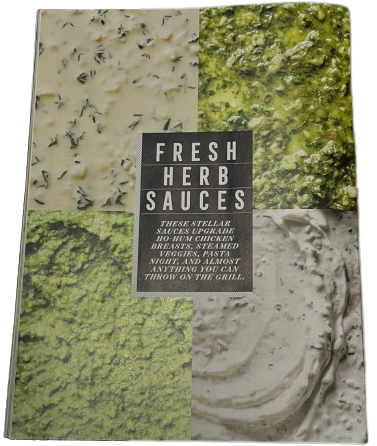
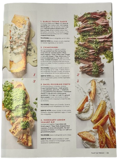
Magazine #3 (Print)
Better Homes & Gardens: Fast & Fresh
The following images are from an issue of Better Homes & Gardens, a well-known magazine that covers lifestyle-related topics, including homes, gardening, crafts, entertainment, healthy living, and of course, cooking. It arises from Better Homes & Garden's Fast & Fresh special, which as implied by the title, clearly shares fast and fresh meals.


NUMBER OF IMAGES: 8
NUMBER OF TOTAL PAGES FOR ARTICLE: 2
DESCRIPTION OF EACH IMAGE:
FIRST PAGE: There are four extreme close-up shots of different sauces (garlic-thyme sauce, chimichurri, basil-pecorino pesto, and rosemary-lemon yogurt dip).
SECOND PAGE: These four sauces are served and plated with other foods, including the following: in box #1, there is a piece of fish; in box #2, there is a piece of cut-up steak; in box #3, there is a piece of cut-up grilled chicken; and in box #4, there are roasted potato wedges.
HEADLINE: "Fresh Herb Sauces"
SECTION TITLE: "Garlic-Thyme Sauce," "Chimichurri," "Basil-Pecorino Pesto," and "Rosemary-Lemon Yogurt Dip"
PULL QUOTES: N/A
ARTICLE FONT FORMAT: The headline is white, capitalized, bold, and written in a sans-serif font. While the text under it is also capitalized and white, it is not bold and is written in a serif font. As the section titles are red, capitalized, bold, and written in a sans-serif font, they stand out from the text below, which is simply written in a black sans-serif font. However, whenever certain words need to be emphasized, they are bolded, capitalized, or both.
STYLISTIC FEATURES: This double-page spread does not have as many stylistic features as the previous two magazines. However, one example in this article is a decorative black rectangle—mainly surrounded by thin stripes—that surrounds the headline. On this stylistic feature, thin white lines separate each word of the headline, possibly helping it stand out more and appear more decorated.
NUMBER OF COLUMNS PER PAGE: 1
House Style
Overall, every Better Homes & Gardens magazine follows a similar cover page layout: their masthead is relatively small and located on the uppermost section of the page, their cover lines are capitalized, images are photographed with an overhead shot, and its masthead color mainly matches the rest of the text. Regarding the Fast & Fresh magazines (first three images), its ampersand is always written in a color that is used sporadically throughout the cover.


Throughout the magazine, the same sans-serif and serif fonts are used, except in different variations (such as capitalizing, bolding, or changing the colors of certain words/phrases).
The main colors are red, black, and white—colors that are kept consistent throughout the table of contents and double-page spread. Yet, on the cover, dark blue and dark pink are also used but are not used again throughout the rest of the magazine.


Content
This double-page spread shares four fresh herbs and how they can be incorporated into four "stellar, dish-uplifting" sauces. Each herb sauce is photographed and shared in a recipe that not only explains a step-by-step process of how the readers can replicate them at home but also where it is necessary to store them and what they can be served with.
Other Food Double Page Spreads
The following five double-page spreads are some other examples that I really enjoy and would like to use as inspiration for my own double-page spread. These double-page spreads come from publications including BBC Good Food, Food Network, OISHII, and Better Homes & Gardens—some of my favorite "cooking, food, and beverage" magazines!


After conducting this research, I decided that I would like my magazine...
to be more than two pages
to have a distinct COLOR scheme
to have diverse typography (more than one text style)
to have several stylistic features


Comments