Table of Contents Research
- shiraavidan77
- Dec 14, 2022
- 4 min read
Updated: Apr 4, 2023
Assigned to photograph the table of contents pages of magazines in my genre, I decided to go to Publix to view their magazine aisle. As shown below, I selected three magazines that stood out to me the most and contained a unique table of contents to analyze. Thankfully, this entire process helped prepare me for creating my own magazine as I was able to get a better idea of what most tables of contents look like in my genre!
Magazine #1 (Delish)
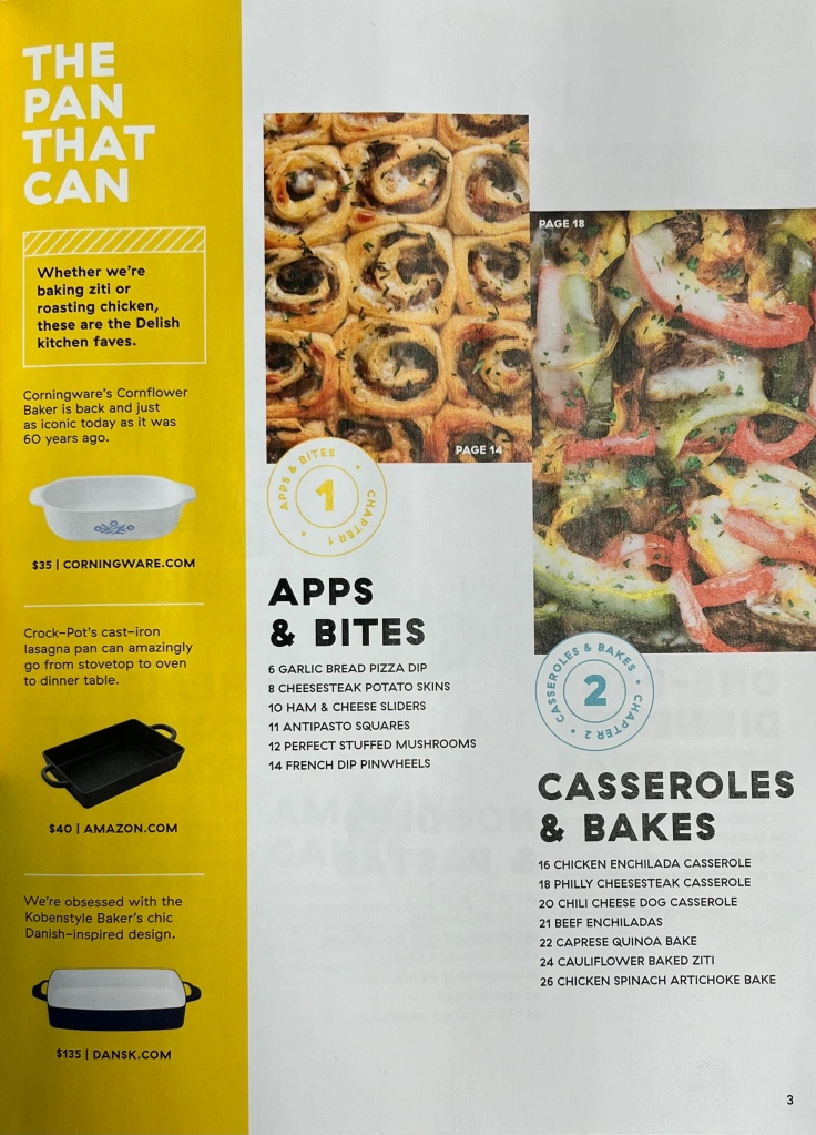


NUMBER OF IMAGES: 8
DESCRIPTION OF EACH IMAGE: All of the images are photographed with an overhead shot and either an extreme close-up or close-up. Image #4 is also photographed with a close-up but at a low angle. The captions show that the featured images are French dip pinwheels, a Philly cheesesteak casserole, cheesy baked meatballs, chicken Alfredo baked penne, cheesesteak stuffed peppers, lemon bars, an Oreo poke cake, and Shakshuka. They use high-key lighting and are not linear.
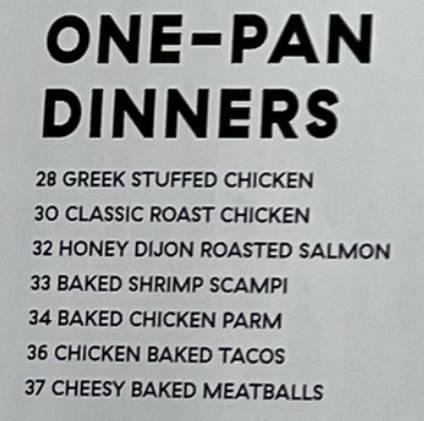
LIST OF SECTIONS: Apps & Bites, Casseroles & Bakes, One-Pan Dinners, Noodles & Pastas, Healthy Comfort Food, Brownies & Bars, Amazing Cakes, and Brunch Favorites
NUMBER OF ARTICLES: 53
HIGHEST PAGE NUMBER: 94
ARTICLES FONT FORMAT: Titles are black, non-bold, capitalized, small, and written in sans-serif
COLOR PALETTE OF FONTS: Black, white, yellow, light blue, red, dark blue, light pink, and orange
STYLISTIC FEATURES: The sections are numbered in a colored circle, and an advertisement is in a yellow rectangular column.
TITLE OF PAGE: N/A
NUMBER OF COLUMNS PER PAGE: 2 on the first page; 3 on the second and third page
Magazine #2 (Saveur)

NUMBER OF IMAGES: 6
DESCRIPTION OF EACH IMAGE: Positioned in the top half of the page, the images are overhead shots of various dishes, including pizza (#10), soup (#28), salmon (#71), cinnamon rolls (#94), etc. All of the images use high-key lighting, but the cinnamon rolls image uses low-key lighting.
LIST OF SECTIONS: Breakfast, Appetizers, Soups and Chilis, Pan-Fried Dinners, Braises and Stews, Seafood, Roasts, Veggies and Sides, and Baking and Pastry
NUMBER OF ARTICLES: 15
HIGHEST PAGE NUMBER: 94
ARTICLES FONT FORMAT: Chapters are red, capitalized, non-bold, and small; sections/titles are bold and non-capitalized; descriptions are non-bold and non-capitalized. All of the fonts are sans-serif.
COLOR PALETTE OF FONTS: Red, black, and white
STYLISTIC FEATURES: Two black rectangles are positioned on each side of the title, and a thin black line separates the article descriptions from the contributors at the bottom.
TITLE OF PAGE: Contents
NUMBER OF COLUMNS PER PAGE: 3
Magazine 3 (Better Homes & Gardens)

NUMBER OF IMAGES: 9
DESCRIPTION OF EACH IMAGE: The images are overhead shots of various foods, including pizza, hot dogs, soup, etc. They use high-key lighting and are positioned in the top half of the page.
LIST OF SECTIONS: Jump-Start Dinner, Tactile Tools, Use it Up, Breakfast Goes Savory, Off With the Top, Fire-Roasted Tomato Salsa, Greens & Grains, Skillet @ Dinner Tonight, Fresh Herb Sauces, Soup's On, The Sheet Pan Can-Can, Cocktails + Mocktails, Expand Your Flavor Universe, Make it Flat, Veggie Quick Pickles, Hook, Line, Sinker, Hand it Over, Pasta Night, Quick Snacks, and Recipe Index
NUMBER OF ARTICLES: 29
HIGHEST PAGE NUMBER: 96
ARTICLES FONT FORMAT: The sections are red, capitalized, non-bold, written in a sans-serif font, and larger than the descriptions, which are small, dark blue, non-capitalized, italicized, and written in a serif font.
COLOR PALETTE OF FONTS: Dark red and dark blue
STYLISTIC FEATURES: The title is outlined in a diagonally striped box, and each image is separated from each other in a thin three-by-three grid.
TITLE OF PAGE: Contents
NUMBER OF COLUMNS PER PAGE: 5
Section Comparison
In all three magazines, the sections are laid out below the images.
In the last two magazines, the sections take up about half the page; however, in the first magazine, the sections take up little space in comparison to the large images.
In the first magazine, the sections have no descriptions; however, in the last two magazines, there are descriptions present.
Photography Comparison
Based on my three magazines, the average table of contents in the food genre tended to have between 6-9 photos depending on its length.
All displaying a different food dish, these photos were often overhead shots, close-ups, and extreme close-ups.
These photos never took up an entire page and were rather small as they were positioned with several other pictures.
Most of the photos were taken with high-key lighting, meaning there were minimal shadows and brightly lit frames.
In the first two magazines, the images displayed the dishes with a decorative background, while the third magazine contained images that were transparent.
Font Comparison
In the first two magazines, the articles are formatted with a bold title and normal description; however, in the third magazine, the titles are not bold and stand out by being red instead. Plus, the descriptions are italicized and written in a serif font, unlike the descriptions of the first two magazines.
Regarding the pictures above, in the first two magazines, only one font is used, and the typography only changes by being capitalized and bolded in the title; however, in the third magazine, two different fonts are used (serif and sans-serif). The title of the last magazine is also red and capitalized.
Similarities and Differences
Similarities | Differences |
•Have more than one font color •Primarily use high-key lighting •Images are positioned on top of the sections/articles •Sans-serif sections •Pages have white backgrounds. | •Vary in the number of sections, articles, images, font colors used, etc. •Significantly vary in typography •Different title placement (1st magazine has no title, 2nd magazine has its title on top of the page, and 3rd magazine has its title below its images) |
Personally, I think that these similarities and differences work well in the three magazines as it contributes to their uniqueness and creativity. Observing these magazines gave me several ideas for how I'd like to present my own magazine, some of them including the following: creating a multi-page table of contents rather than one page, using a distinct color palette, using different fonts and typography, etc. Out of these ideas, my favorite is the usage of a distinct color palette since I believe that making my table of contents page more colorful can attract more attention and become more visually appealing.


Comments