Article 2nd Draft: Decisions and Revisions
- shiraavidan77
- Apr 9, 2023
- 5 min read
Updated: Apr 9, 2023
After creating a second draft for my cover and table of contents spread through a series of revisions, I then created a second draft for my article. Surprisingly, just like my table of contents, I once again found numerous parts of my magazine that were in need of revisions due to human error and advice from my class critique. Therefore, I am glad to say that my article's second draft looks significantly different than my first draft...in a good way! The changes I made, along with the reasoning behind the changes are outlined below.
Article Changes
Change #1 (Grammatical errors)
BEFORE

AFTER
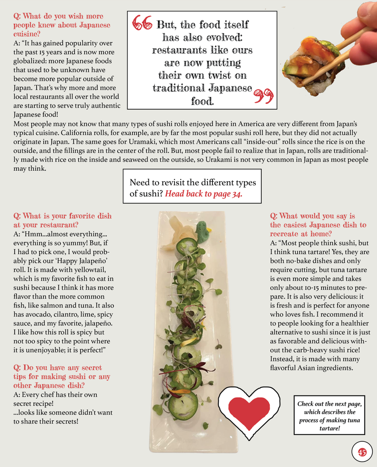
As stated by my peer, Sabrina, one grammatical error that was necessary to fix was the improper use of ellipses in the first paragraph of my article. I made this change since grammatical errors (or any careless errors in general) result in low legibility, poor communication, and/or misunderstandings. Especially since writers most likely read over their articles several times to check for careless mistakes, having such an error in my own article is not realistic. After all, since this grammar issue was located at the beginning of my article, some readers would've had a negative first impression of my entire magazine! NOTE: Other slight grammatical errors were fixed throughout the body copy of my article to improve legibility and increase accuracy.
Change #2 (Changing format of footer)
The two pictures below are the footers from the first page of my article.
BEFORE
AFTER
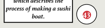
This change wasn't directly suggested by my classmates, but it was inspired by previous feedback I received for my cover that was also implemented in my table of contents spread. In fact, as feedback for my cover, Lia suggested adding the word "page" on the icon that states the page of my main cover line's article. Following this style, I added the word "page" to every circle that states page numbers, including all of the pages on my article.
Another change I made to my footer was originally suggested by Wren for my table of contents—to add my magazine's name near the footer. To follow this style, I added its name near the pages.
Lastly, as shown in the two images above, I changed the page number of my first page. Originally, it was set as page 43, but I then changed it to page 41. As not shown in the images, I also changed the page numbers of the other three pages accordingly. I made this change since having the correct page numbers of a magazine is crucial; readers constantly navigate a magazine's pages, and even if one page is incorrect, they will most likely have a hard time identifying an article. Especially since my table of contents stated that the first page of this article was page 41, if I kept the original page number at 43, the readers would not be sent to the right page to read this article.
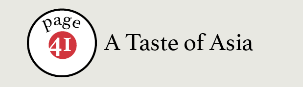
Change #3 (Changing format of STEp-BY-Step Process)


This change wasn't suggested by classmates, but I decided to add circles on the top lefthand corner of each image as a more distinct variation to the original numbered list. I picked red for the circle's background since it is most widely used throughout my magazine. I reconsidered black for the numbers, but as I realized it was already used for the captions, I decided to use white instead. Not only did these changes make the step-by-step process more visually appealing but they also made the steps more clear. Therefore, the readers will be able to easily understand that the steps must be read horizontally.
Change #4 (Changing FONT OF INTerview Questions)

BEFORE

AFTER
This change wasn't suggested by classmates, but I decided to change the font of the interview questions from Fredericka the Great to Athelas (the font that is used for the interview answers). I did this because I believe the typography in the interview part of my magazine would be more consistent if the font of the questions and answers remained the same. Plus, Fredericka the Great (the font that was originally used for the questions) is normally used in my magazines for titles of pages or larger pieces of text. After making this change and seeing the result, I believe that Athelas was a better choice.
Change #5 (Changing Layout AND WORDING)


The following changes weren't suggested by my classmates.
As the first page of my article changed the typography of words with positive connotations and denotations, I decided to implement the same on the third page of my article. In the first paragraph, I changed the typography of the word, authentic, by the following: changing the font from Athelas to Rock Salt Pro, changing the color from black to red, and lowering the font size from 12 to 10 as this new font is larger. I replicated this process in the two other paragraphs, thus allowing meaningful words to significantly stand out more.
I adjusted the format of the paragraph accordingly, which I think currently looks neater and well-structured.
NOTE: This change was made on the third question of this page (the question that refers to the chef's secret tips) and refers to the text that states, "...looks like someone didn't want to share their secrets!" I outlined this text in a white rectangle to ensure that my readers won't think that it was part of the chef's answer.
Change #6 (Changing look of recipe descriptions)

BEFORE

AFTER
This change wasn't directly suggested by my classmates, but it was inspired by previous feedback I received for my table of contents; Sabrina suggested altering the look of the slash to appear as an "X." If I didn't make this change as I did in my table of contents, it would create slight inconsistency that would look unprofessional. Considering that these recipe descriptions would've been used throughout articles that share recipes, there would have been inconsistency among most of my magazine!
Change #7 (Changing look of recipe)
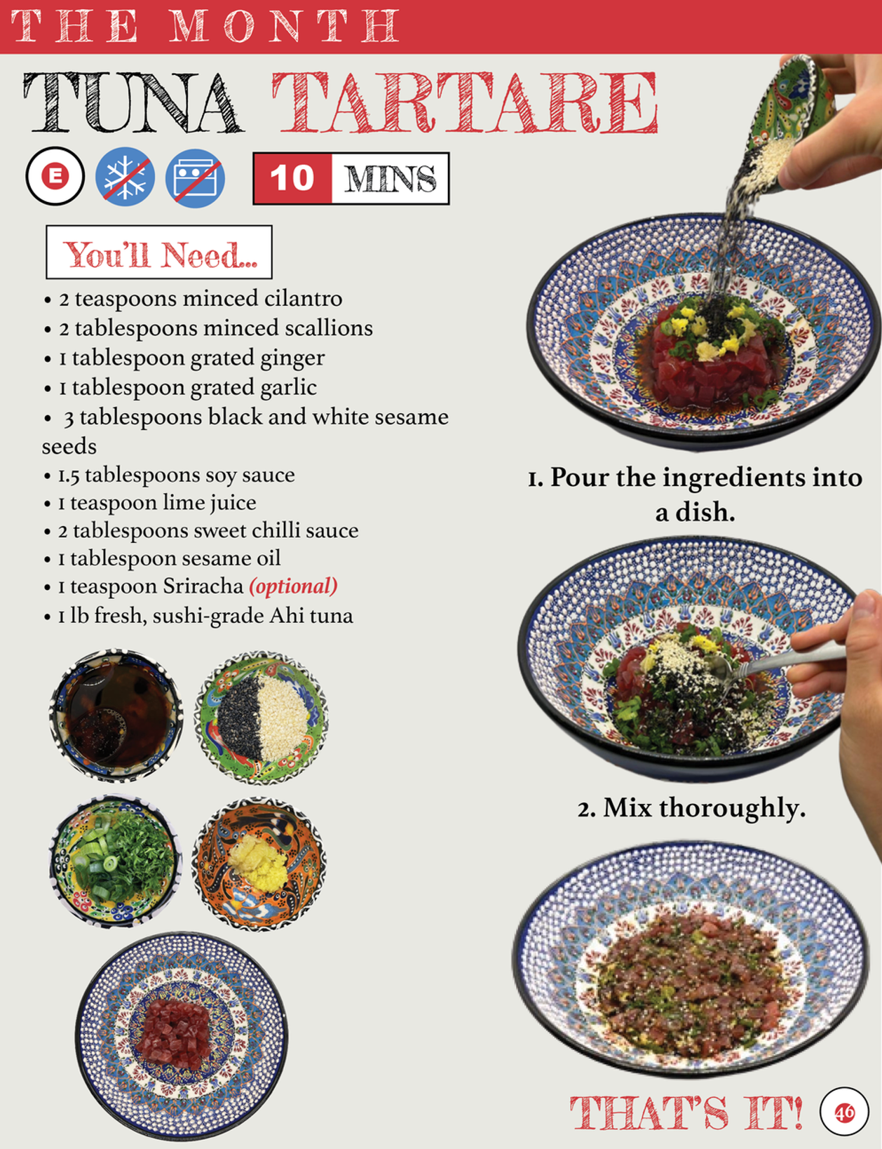


Lia stated that it would be more conventional to place the text below the ingredient it describes. Personally, I think this was a great idea as the readers would be able to see what each ingredient looks like in a more organized and visually appealing manner.
The following changes weren't suggested by my classmates.
I added a "Make it..." section to clearly separate the ingredients from the step-by-step process of making the dish. I ensured that the textbox looked the same as the "You'll Need" section by using a white background and a thin black stroke.
Rather than the steps being positioned underneath each image, I placed them near towards the left as the first two images (containing my hands) are cropped out. Therefore, they wouldn't look neat if they weren't placed on the righthand side of the page.
Extracted from my interview with Chef Misayo, I added a meaningful pull quote that acts as a cooking tip for the readers following this recipe. It uses the same style as the pull quote on the previous page to add consistency.
I added a section that describes what to do after finishing the recipe, in terms of how the dish can be served and stored—necessary information that the people following the recipe would need to know. By stating "Only 2 steps? Yup, that's it," it emphasizes to my target audience how quick and easy this recipe is, persuading them to make the dish.
Other Changes
NOTE: I also made slight changes to the article's wording to increase fluency.
COMPARISONS
First draft (without changes)


SECOND draft (with changes)


Comments