Magazine Cover: Final
- shiraavidan77
- Apr 9, 2023
- 4 min read
After a series of revisions and decisions, I have produced my final magazine cover. Despite only having slight variations from my first draft, I believe that my current final cover is significantly more conventional in the cooking, food, and beverage genre and thus, of higher quality. Thankfully, I believe that part of my cover's success can be due to the cover research I conducted throughout this course which gave me more knowledge about codes and conventions. However, I had less knowledge when creating my first draft and even less when I drew my magazine cover sketch a few months ago, meaning my final draft is undoubtedly more sophisticated due to having more research. The comparisons between these three covers are outlined below.
Magazine Cover SKetch V.S. Final COVER


SKETCH Final COVER
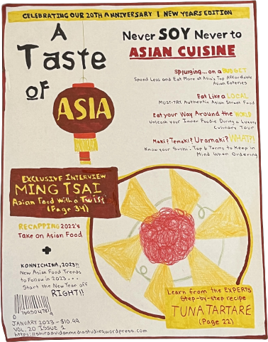
It is evident that my magazine cover sketch and final draft look significantly different: the main image is shot with another angle and plated differently, the masthead is written and positioned differently, the barcode is positioned on a different side of the page, etc. Each cover has its pros and cons, but if I was a customer with the option to purchase either magazine, I would definitely pick the magazine to the right (my final cover). Divided into categories, my main reasons are as follows:
TYPOGRAPHY: Despite liking the typography of both of these covers, I prefer my final cover's take on not only fonts, but also sizing, color, and kerning. Unlike my magazine cover sketch, my final cover uses more fitting typography for its masthead. Although they both use Letter Sseungi for "A Taste of," I like how my final cover uses Snell Roundhand for "Asia" unlike my cover sketch, which uses "Vogue." In fact, due to its calligraphic style, Snell Roundhand is more elegant and eye-catching, connoting the true beauty of Asia. Heavily used by Food Network Magazine, I also like my final cover draft's usage of Fredericka the Great, which looks stylistic due to its sketch-like crevices in the letters. Rock Salt Pro was another great font choice; due to it appearing handwritten, it is informal and artistic, contributing to the overall mood of my magazine. When these fonts were used, I like how my final cover added even more emphasis by either highlighting, italicizing, or changing the size and colors of the words...a widely-used convention of my genre! MAIN IMAGE: I like my final cover's main image more due to the angle it was shot at, which not only shows the beauty of the food but also the intricate details of the bowl. However, my magazine cover sketch's image, which appears as if it was photographed with an overhead shot, is more conventional.
PLACING OF ELEMENTS: I believe that my final cover's magazine elements are placed more appropriately. For instance, the following placements are more conventional: the barcode is on the right-hand side of the page, the masthead is placed horizontally at the top of the page, the main cover line is more distinct, etc. However, I like how the magazine cover sketch's cover lines are also neatly aligned. OVERALL USE OF CODES AND CONVENTIONS: Overall, I believe that my final cover is more convincing as a magazine due to it following the most codes and conventions of my genre.
First DRAFT V.S. Final COVER


First Draft Final COVER
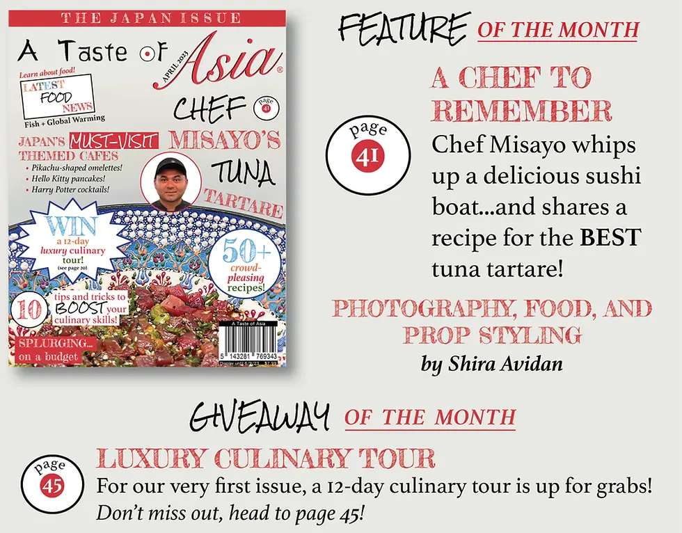
Unlike my magazine cover sketch and final cover, my first draft and final cover have fewer differences. However, I feel that these differences were essential to my magazine's overall layout, thus why I believe that my final cover was the most successful. Divided into categories, my main reason is as follows:
CLARITY AND ACCURACY
Originally, when creating my first draft, I was unaware of the content that I would include in my table of contents. Therefore, my first draft's puff stated that this magazine features "80+" recipes; in reality, my tables of contents did not contain many articles that share recipes. Therefore, changing the number to "50+" recipes was more accurate and would create less confusion.
Thanks to my class critique, I was inspired to add the word "page" on the icon in my main cover line that shows the page number of the feature article. This simple yet effective change makes it clear to the readers that the number 40 refers to a page number. On the other hand, simply stating the number 40 is unspecific and confusing.
Changing the page number from 40 to 42 is more accurate according to my table of contents. It takes into consideration that magazines usually have even page numbers on the lefthand side of the page, which is where my article starts.
I don't like how my first draft contains the phrase "New Series" in one of my cover lines, which implies that my magazine is not new. However, the previous statement is false as my magazine is new.
REFLECTION
Overall, I believe that my final cover was successful since it effectively reaches my target audience while following and subverting codes and conventions! However, as expected, this process wasn't easy, especially since I used not one but three Adobe programs for the creation of my cover—Photoshop, InDesign, and Illustrator. Especially since the cover was the first page of the magazine I created, I had the least practice with these programs. Therefore, not having full knowledge about their tools meant creating my cover was a lengthy and challenging process. In fact, making my cover was the first time I ever used InDesign, meaning I wasn't familiar with navigating the program. With practice, however, I realized that InDesign isn't as complicated as it may seem!


Comments