Table of Contents: Final
- shiraavidan77
- Apr 9, 2023
- 2 min read
Updated: Apr 12, 2023
After thoughtful consideration, I have revised two drafts of my tables of contents spread while paying close attention to page numbers, font choices, and my magazine's house style. Therefore, I was thankfully able to finalize and—of course—improve my original drafts for clarity, legibility, style, etc. The two images below are my first draft and my final table of contents, respectively.
FIRST DRAFT V.S. Final COVER
First Draft

FInal COver

Although slight, it is evident that I made several beneficial changes to my table of contents, hence why I can conclude that I like my final version better than my first draft. Divided into categories, my main reasons are as follows:
CLARITY AND ACCURACY
As I decided to add the word "page" onto every circle that states page numbers after originally being suggested to do so on my cover, it was imperative that I made this change throughout my entire magazine, including my table of contents spread. However, I will acknowledge that I like the format of the first draft better, where it doesn't say "page" on the circle near each article since it appears less crowded. However, since I added the word "page" on the cover, adding it on every other circle allowed for consistency.
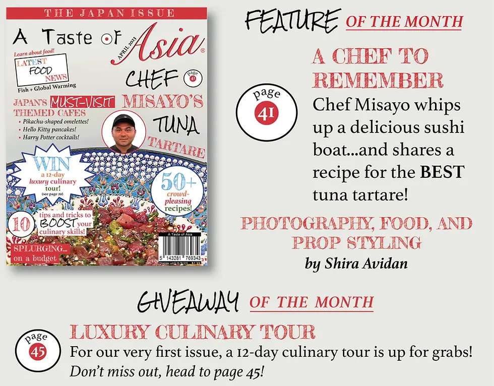
Unfortunately, while creating my first draft, I failed to notice that one of my image captions was inaccurate! In fact, I intentionally added the leftmost images on page 2 to describe the article on page 19, but I originally wrote "14" instead. Thankfully, correcting this human error ensured that my magazine was accurate and, thus, more realistic.
ADDED MAGAZINE ELEMENTS
I also like how I added an "On the Cover" section in my final cover as it is a widely-used code and convention across magazines in my genre. It is also fitting in this context as I have a picture of my cover right near it.
Unlike my first draft, my final cover contains a footer with my magazine's name and issue date. This change is also more conventional.
TYPOGRAPHY
As already mentioned, I made two slight changes to my first draft's typography, one being that I changed the font of the image captions from Athelas to Rock Salt Pro. This typography change made the page numbers more distinct by adding more artistic value to what was originally unappealing text. In the first draft, this font was not used: instead, I only used Athelas for the article descriptions and smaller pieces of text as well as Fredericka the Great for the article titles and other larger pieces of text. However, on my cover, I use Athelas, Fredericka the Great, AND Rock Salt Pro, meaning using this font contributes to my house style.
REFLECTION
Overall, I believe that my final table of contents was successful since, like my cover, it effectively reaches my target audience while following and subverting codes and conventions. Surprisingly, out of every magazine page I created, the table of contents was the most challenging process! In fact, this spread contained the most intricate details that were not only tricky to create but also to navigate around the spread if they needed to be readjusted. For instance, in the recipe descriptions section, I designed snowflakes and an oven with just a line tool on InDesign. These icons often had to be moved around my page, which was difficult to do without ruining their look.


Comments