Classmate Critique
- shiraavidan77
- Apr 6, 2023
- 3 min read
Updated: Apr 8, 2023
When readers purchase magazines, they may fail to acknowledge that the published content they are about to read is likely to have undergone several modifications; before being distributed to the general public, layouts may have been slightly re-designed to appear more visually appealing, images may have been enhanced through editing apps, or content may have been added or removed. Conducted by professional designers or editors with expertise and knowledge in the magazine's genre, it is clear that magazines undergo revisions to improve quality: they are carefully read and evaluated before being approved for publication. Therefore, I implemented the exact same process with my own magazine while keeping one distinct goal in mind—to ensure that my magazine will be as successful as possible by listening to perspectives other than my own!
I have currently finished designing what I believe to be a successful cover page, a table of contents spread, and a four-page article that implement numerous codes and conventions of my genre. Yet, even though I have a positive opinion of my own magazine, it is important to note that other people may not: they may notice unappealing elements they believe need to be revised, contributing to them thinking less highly of my magazine. Therefore, to reduce these unappealing elements, I showed my first drafts to my classmates, allowing me to receive plentiful feedback—both positive and constructive. That way, before my magazine is considered "final," I can significantly improve its quality based on the changes advised by my peers.
First Drafts
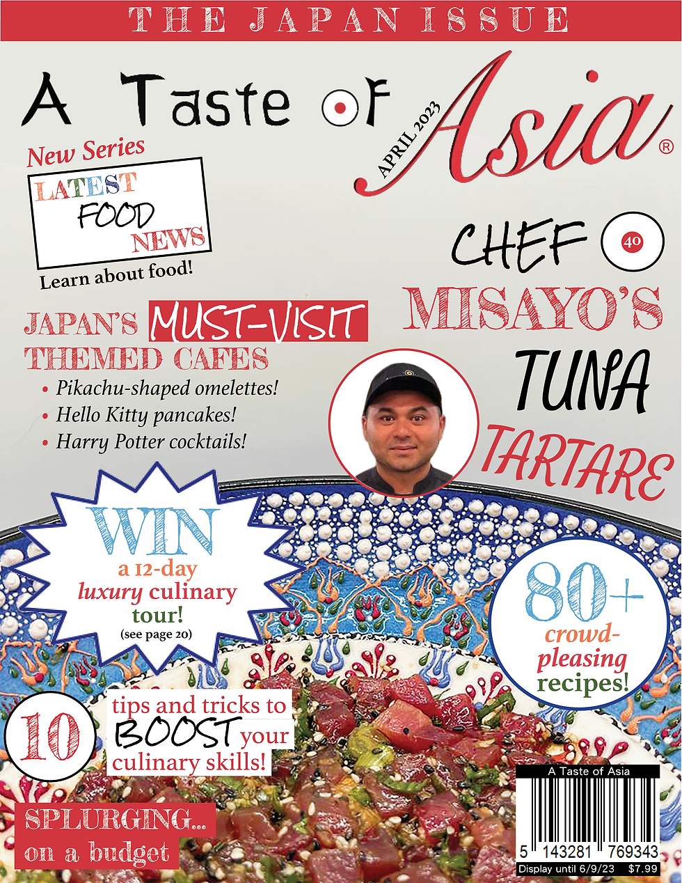
The images below are my drafts of . They are the images I showed to my classmates.


As previously mentioned, magazines are edited by experts with an abundance of expertise and knowledge. In this case, the "experts" that reviewed my own magazine were 4 of my classmates, who are also taking AICE Media Studies and who I believe to be unbiased and reliable! Discussing the positive and negative aspects of my magazine with this group of people meant I was able to receive feedback from reliable sources—people who have knowledge about magazine codes and conventions. These people can formulate this knowledge into feedback that would actually benefit my final product, unlike if I were to receive feedback from people who aren't taking this course. What I liked the most was that 75 percent of the people who gave me feedback were also producing cooking, food, and beverage magazines, meaning they have even more knowledge than the other students in my class that are producing magazines from other genres.
Below are the students I discussed with, along with tables that represent the positive and constructive feedback I received on my cover, table of contents, and article. The last column, which could be fully seen with the slider at the bottom of the table, state whether or not I will implement the constructive feedback in my magazine.
Student #1: sabrina
PART OF MAGAZINE | POSITIVE FEEDBACK | CONSTRUCTIVE FEEDBACK | WILL I INCORPORATE CONSTRUCTIVE FEEDBACK? |
|---|---|---|---|
Cover | Sabrina likes how the color scheme of red, black, and white are heavily contrasting from each other, acknowledging that my magazine has a very diverse color palette that goes well together. She likes how the red and black colors stand out from the off-white background. She also likes how my masthead is unique and represents my Japanese theme due to the colors and Asian-inspired font. | Sabrina stated that the font of the "tuna tartare" part of my main cover line was inconsistent as I never used it again in my cover, let alone another time throughout my magazine. | I will definitely incorporate this feedback! Although there should be several fonts used on the cover, I don't think one font should be used for only two words. |
Table of Contents | Sabrina likes how the spread is organized and how the same color scheme from the cover is used. She also acknowledged the inclusion of the recipe descriptions section and how as an effective code, it makes the magazine look realistic and properly engages with its target audience (by categorizing recipes based on dietary restrictions, culinary levels, and usage of kitchen appliances). | Although Sabrina positively acknowledged the recipe descriptions section, she suggested transforming the slash into an "X" on the "No-bake" and "CAN'T be frozen" icons. | Once again, I will also incorporate this feedback since an "X" is more clear, and in this scenario, it implies that a certain kitchen appliance isn't/can't be used. |
Article | Sabrina likes how even though there is a large amount of information present on each page, the usage of columns acts as a code that neatly organizes the content. | Sabrina pointed out a slight grammatical error on the first paragraph of my article. She said that instead of using ellipses in "on the rice...sorry, rise...," I should use em dashes. | I agree with Sabrina since grammatical errors are not only unpleasant when reading but also unrealistic; most magazines have little (if not no) grammatical errors in their articles. When I revise my magazine, I will alter this issue, but, most importantly, I will proofread my work more carefully to avoid even more grammatical errors. |
Student #2: Wren
PART OF MAGAZINE | POSITIVE FEEDBACK | CONSTRUCTIVE FEEDBACK | WILL I INCORPORATE CONSTRUCTIVE FEEDBACK? |
|---|---|---|---|
Cover | Like Sabrina, Wren also thinks the colors work well together. She also likes the eye-catching designs, like the comic bubble in the puff and the inclusion of the Japanese flag in the letter "O." | Wren thinks that my cover layout is very busy; there are many magazine elements that are crowded and are therefore hard to read. | I will do my best to minimize the text on my cover, whether it means reducing the size of the text or taking out some text. However, I believe that as long as the large amounts of text don't detract any meaning from the cover image, a busy layout can be considered acceptable. |
Table of Contents | Wren likes the transparent images since they create strong focus on the subject, meaning the readers are more likely to pay attention to the images. She stated that if the images weren't transparent, the readers would most likely be distracted by the images' backgrounds, ruining the images' main purpose—to act as visually appealing ways of showcasing the articles. | Wren suggested to add my magazine name near the page number on each page. | I think Wren suggested a great idea since adding a magazine name is more conventional. |
Article | Wren likes how an abundance of information is present in my article, thus making it more informative and fascinating for the part of my target audience that enjoys discovering must-visit restaurants, how chefs prepare dishes, and following recipes (content discussed in my article). | Wren thinks that my images are somewhat monotonous; they lack variety and are very similar. She suggested to edit the photos to include a wider variety of shots and angles. | As I think that my images portray a realistic restaurant environment, I will not edit my images; I will keep them in their original form. In other words, I do not think it will be feasible to somewhat redo the work of my final photoshoot. |
STUDENT #3: Anastasia
PART OF MAGAZINE | POSITIVE FEEDBACK | CONSTRUCTIVE FEEDBACK | WILL I INCORPORATE CONSTRUCTIVE FEEDBACK? |
|---|---|---|---|
Cover | Anastasia likes how the colors of the dish match some of the magazine elements, such as the puff and pug, as it creates uniformity between these elements. She also stated that I include the common convention of puffs and pugs being written with different colors than other magazine elements on the page that are not necessarily part of the magazine's color scheme. This is because it draws more attention to the more distinct puff and pug. | Anastasia doesn't like how the date ("April 2023") is rotated to fit alongside one of the letters of the masthead. She recommends changing it to be placed in the corner, where it is more visible. | Personally, I believe that the way I laid out my date is a more creative approach to the standard horizontal text. |
Table of Contents | Anastasia said that she really likes how my magazine's house style was incorporated onto my table of contents. She said this adds realism and is visually appealing. Lastly, she told me that my cover lines were clever and well-written, such as the reference to the song, Sweet Dreams Are Made of This. | Anastasia suggested making the shadows more realistic by either removing or adding more shadows. | I somewhat disagree with Anastasia; I think the shadows do look realistic. |
Article | Anastasia told me that she loves my images, especially the transparent image of me picking up sushi. She said that in this context, non-transparent images would've been less effective as it would create distractions from the background. | Anastasia pointed out that on page 43, one of the paragraphs was cut out (some text was hiding)—a careless mistake I made due to human error. | I will undoubtedly take Anastasia's feedback into consideration and enlarge the textbox to ensure that all of my words appear on my article. Thanks to Anastasia, when I revise my magazine drafts later on, I will be more careful when placing and editing text. |
Student 4: Lia
PART OF MAGAZINE | POSITIVE FEEDBACK | CONSTRUCTIVE FEEDBACK | WILL I INCORPORATE CONSTRUCTIVE FEEDBACK? |
|---|---|---|---|
Cover | "Between the red and white fonts and shapes that represent the Japanese flag, you really sold on the Japanese theme," quotes Lia! She continued to state how the diverse typography immediately attracted her attention" like no other." | NOTE: Lia is referring to the circle on my main cover line, which describes the page number of the feature article. She states to write "page 40" instead of just "40." | I will definitely implement Lia's suggestion as it will make it more clear to my readers what the number 40 refers to: it is not clear that I was referring to a page number. |
Table of Contents | Lia likes the inclusion of the recipe descriptions: she thinks it's clever as it makes the recipes easy to understand and is useful for visual learners. She also stated how writing "feature of the month" was very clever as it draws extra attention to the double-page spread, which is the feature it refers to. She also said how my cover lines use pathos to appeal to my target audience, and when I did this, I emphasized the words through the use of bolding, italicizing, and capitalization. | On the more negative side, Lia thinks it would be more fitting to write "On the Cover" instead of "Feature of the Month" and "Giveaway of the Month." | I agree with Lia since the "Giveaway of the Month" and "Feature of the Month" sections are somewhat irrelevant: they are both evidently on the cover, meaning it would be more fitting to write "On the Cover." |
Article | Unlike Wren, Lia thinks that the images are of high quality and look professional! She loves the informational and eye-catching pull quote that helps draw attention with the enlarged quotation marks. | NOTE: Lia is referring to the last page of my article (the recipe for tuna tartare). She believes that each text should be located near the image it describes. | I definitely agree: positioning the images near the text makes it clear to the readers what each ingredient looks like. |
Reflection
After analyzing the abundance of feedback I received from my peers, I can conclude that my class critique experience was beneficial to an EXCEPTIONALLY HIGH EXTENT! Even though I haven't started to revise my magazine drafts yet, I can already project that this peer revision will be helpful when finalizing my magazine, in which I will apply all of the feedback I received today to create the most realistic magazine possible.
On the positive side, hearing people's POSITIVE FEEDBACK made me think more highly about my current efforts, allowing me to become aware of the content that I should keep in my magazine. For instance, hearing most of my peers positively acknowledge the recipe descriptions section in my table of contents allowed me to understand that it is necessary to keep it in my magazine. Thankfully, I was made aware that my magazine is clear in terms of what I am trying to communicate in my product: most people properly acknowledged my magazine's unique house style, mood, and Japanese theme.
On the other hand, hearing people's CONSTRUCTIVE FEEDBACK opened my eyes to the negative aspects of my magazine that should be fixed. That being said, if I didn't take part in my class critique, I wouldn't have been able to identify the errors that lower the quality of my magazine. However, I project that applying my constructive feedback may be difficult as most people had opposite opinions about my magazine: some may like a certain aspect of my magazine, while others may not. For instance, Lia and Anastasia believed that my images were of high quality, while Wren believed that my images were repetitive and of lower quality. I think this change in perspective symbolizes the different social groups of my target audience, who would have different ideologies about certain elements of my magazine.


Comments