Cover 2nd Draft: Decisions and Revisions
- shiraavidan77
- Apr 8, 2023
- 2 min read
Updated: Sep 2, 2023
Ever since my classmate critique, I have been attempting to think of how I can incorporate the constructive feedback I received to improve the layout and content of my magazine. After thoroughly planning out the changes I wanted to make to my original drafts and debating which feedback I wanted to follow, I eventually put the feedback into effect! Therefore, the second drafts of my magazine have significantly improved despite already looking conventional and professional. As the first page of my magazine, which can arguably be considered the most important, I started revising my cover. The changes I made, along with the process and reasoning behind the changes are outlined below.
Cover Changes
The video below outlines the four changes I made to my cover.
Change #1 (Adding "page")


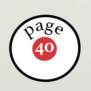
BEFORE AFTER
One of my peers, Lia, stated that my original method of showing the page number (see leftmost image) was unclear and vague as the number 40 can refer to anything. She told me to add the word "page," so the readers can truly understand that the number 40 refers to the page number of the article. Therefore, if the readers are interested, they could easily identify where to read the article in terms of its page number. With that being said, as I used this method of showing page numbers across my table of contents and article, I will add the word "page" on these areas of my magazine as well.
Change #2 (Changing fonts of Main Coverline)

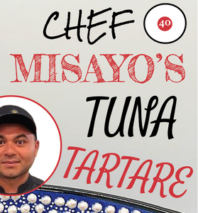

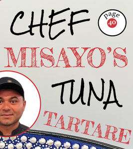
BEFORE AFTER
One of my peers, Sabrina, stated that in my original main cover line (see leftmost image), the font of "tuna tartare" (Satisfy) was too inconsistent. I agreed with her since I only used this font for these two words: throughout my cover, table of contents, and article, this font was never used again. Therefore, I thought it was irrelevant to keep this font, hence why I changed it to the font, Fredericka the Great—a font constantly used throughout my cover and other parts of my magazine.
Change #3 (Changing wording of Coverline)


BEFORE AFTER
Even though this change wasn't suggested by my peers, I decided to change the wording of my topmost cover line. I think the word "new" doesn't fit in the context of my magazine: the word "new" suggests that in previous issues, this series did not exist. Yet, this is my magazine's first issue, thus featuring a new series does not make sense as there haven't been any issues before this magazine. Instead, I replaced the text, "New Series," with "Learn about food," which was replaced with "Fish + Global Warming" (the topic of my article).
Change #4 (Changing wording of puff)


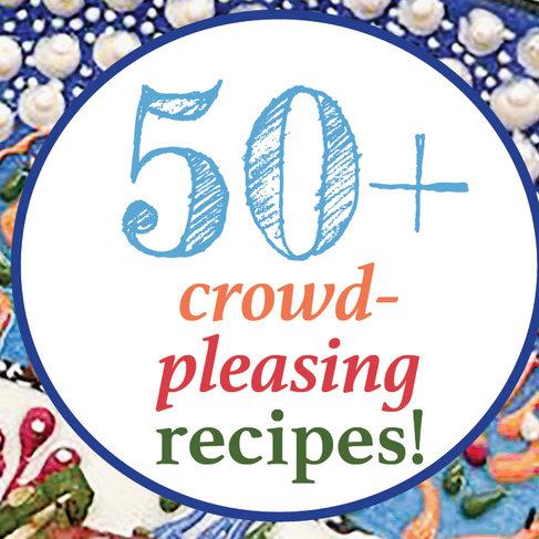
BEFORE AFTER
Once again, this change was also not suggested by my peers, but I thought it was still relevant towards my magazine's overall look. I decided to write "50+" recipes rather than "80+" since my table of contents spread doesn't contain many articles that share recipes, making the original puff's wording misleading. However, the word "50+" is
more truthful!


Comments