Tables of Contents: 1st Draft
- shiraavidan77
- Apr 3, 2023
- 3 min read
Updated: Sep 2, 2023
After having already completed the first draft of my cover page, I then happily transitioned into creating my table of contents. Once again, I made two variations that are slightly different from each other and will potentially be used as my final table of contents.
DRAFTS
Variation #1

variation #2

The differences between the first and second variations are described below.
VARIATION 1 | VARIATION 2 (CHANGES MADE) |
1. The images have shadows. 2. The feature article and giveaway is located on the left side of the page. 3. The recipe descriptions are located at the bottom of the page. 4. The page number font near the images is Athelas. | 1. The images do NOT have shadows. 2. The feature article and giveaway is located on the left side of the page. 3. The recipe descriptions are located above the giveaway. 4. The page number font near the images is Rock Salt Pro. |
PROCESS

Before creating these drafts, I digitally planned my layout on Google Slides to set out my goals and make the construction process on InDesign easier. Originally, I thought a one-page table of contents would be more fitting than a two-page table of contents. As made clear in my final two drafts, I later altered this decision and decided to construct a two-page table of contents. I thought this would be a great idea as I would be able to fit more meaningful information. FOR INSTANCE, in this plan, I was unable to fit images of any dishes that relate to the cover lines. Thus, I believe that this draft was not visually appealing, and most importantly, did not fit the codes and conventions of my genre.
Please watch the video below, which demonstrates the creation process of my table of contents. NOTE: This video only demonstrates the creation of my first variation!
Having already designed my cover and table of contents on InDesign, I can conclude that the table of contents was harder. Unlike my cover, I used more images, intricate details, and textboxes, meaning the process was more extensive and required more effort. On the positive side, learning how to properly navigate InDesign will significantly help me when constructing my double-page spread, which will possibly be even more difficult. The following animated images reflect what I learned while creating my table of contents!

I learned how to create rounded rectangles.
Final Choice
After thoughtful consideration, I have decided to select the first variation of my first table of contents draft out of the two variations I created. My reasons are as follows:
I like how all of my images contain shadows as it appears more realistic. Especially since my images are transparent and already have no backgrounds that stand out, the shadows add more depth and help pop out the images.
I like how the feature and giveaway are located on the right side of the page as I believe it would be more appropriate for the readers to read the articles first to get a glimpse of what will be covered in my magazine.
Codes and conventions
As I tried to make my table of contents realistic as possible, it uses several codes and conventions of the cooking, food, and beverage genre. These are demonstrated in the image below!

examples of my magazine using codes and conventions
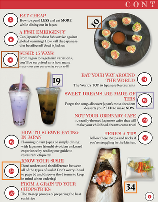
RECIPE DESCRIPTIONS: Most magazines have dietary symbols at least somewhere in their magazine, allowing target audiences to pick the recipe that's the best fit for them!


LAYOUT:
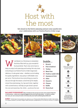
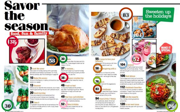
PAGES: Some cooking, food, and beverage magazines have double-page tables of contents, allowing for more room to be creative with the spread's layout. In fact, having more space allows for the inclusion of more magazine elements that most likely would've been left out with less available space. For instance, in the two images below, it is clear that double-page tables of contents are created with a distinct purpose: to allow for more eye-catching and informative content that the target audience can connect with.
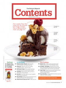
COLUMNS: Magazines of this genre use columns to neatly organize their article descriptions. Although relatively overlapping, I attempted to use two columns in my magazine.


IMAGES: To visually supplement the article's descriptions, almost all cooking, food, and beverage magazines contain images of food on their tables of contents, hence why I thought it was necessary to include images as well. In fact, as the images included on these pages are almost always annotated with their page numbers, they distinctly specify which article the dish arises from. Therefore, if a reader happens to be interested in one of the dishes, they are able to pinpoint where they can read the article in a matter of seconds.


TITLE: Most tables of contents have the word "Contents" as a title since it is the clearest and simplest way of pointing out to the readers where the table of contents is.


Comments