Cover: 1st Draft
- shiraavidan77
- Apr 1, 2023
- 4 min read
Updated: Sep 2, 2023
Recently, I have been heavily focusing on producing the cover page of my magazine, and as of now, I have created two variations that could potentially be used as my final cover. With the help of my prior research of magazine covers, I have taken into account the codes and conventions of my genre to ensure that my magazine is as realistic as possible. I have also used the results from my target audience questionnaire as inspiration to ensure that my magazine truly represents its target audience.
Drafts


The differences between the first and second variations are described below. Although it may not look like it, I made several changes!
VARIATION 1 | VARIATION 2 (CHANGES MADE) |
1. The word "MISAYO'S" is positioned with the other words from the main cover line. 2. The main cover line's page number is described in the "Japanese flag circle." 3. The "New Series" cover line is rotated. 4. "APRIL 2023" is bold. 5. "THE JAPAN ISSUE" is written in the font, Fredericka the Greatest. 6. The pug is relatively big. 7. The puff is located on the left-hand side of the page. 8. All of the cover lines (not including the main cover line) are located on the left side of the page. | 1. The word "MISAYO'S" is wrapped around the image of the chef. 2. The main cover line's page number is described in the phrase, "FIND ME ON PAGE 46!" 3. The "New Series" cover line is NOT rotated. 4. "APRIL 2023" is NOT bolded. 5. "THE JAPAN ISSUE" is written in the font, Bangla MN. 6. The pug is smaller. 7. The puff is located on the right-hand side of the page. 8. The "New Series" cover line is located on the right side of the page. |
PROCESS
As originally stated in my Cover Design Research, I planned to create my cover on three different Adobe programs for a different aspect of my cover; I planned to...
1. Use Adobe Illustrator for creating my masthead
2. Use Adobe Photoshop for editing my main image
3. ...and use Adobe InDesign to add textual magazine elements
Prior to creating my two cover drafts, I had only created and revised my masthead (step #1), meaning the steps I had left were editing my main image and laying out the different forms of text.
Step #2: Editing main image on photoshop

Photographed during the second part of my final photoshoot, the photo to the left was my the image I chose for my cover. I was 100 percent sure that I wanted to edit this image on Photoshoot since I thought it was dark and unappealing, but while doing so, I noticed something else—the bowl took up a vast majority of the page! Therefore, if I created my cover with this unedited image, I most likely wouldn't have been able to fit the proper magazine elements without covering most of the dish. In other words, it was crucial that I edited this photo. The process of how I did so is illustrated below!
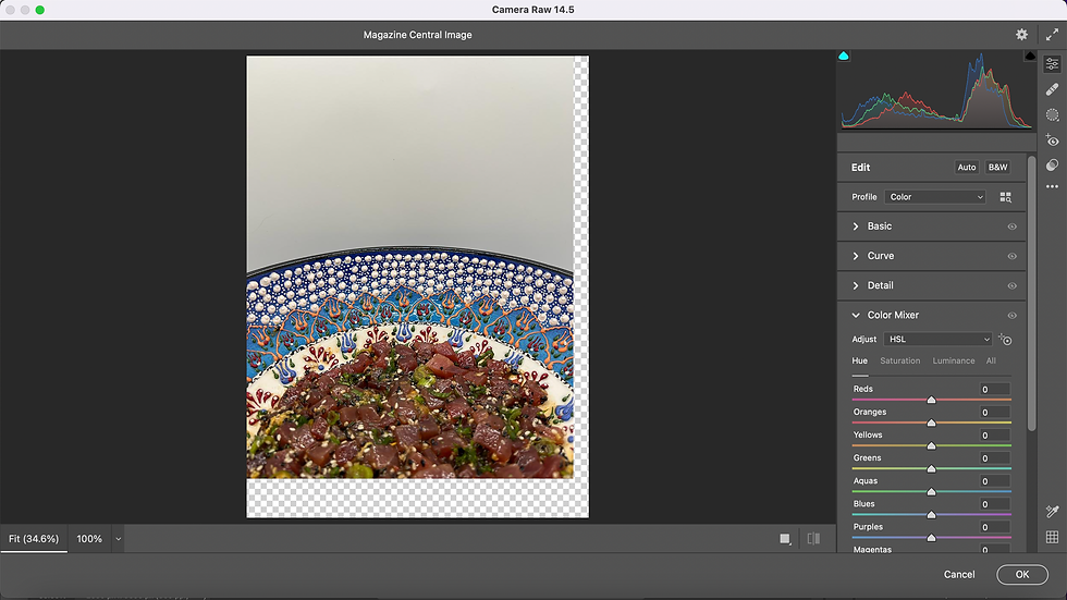
Step 1: I placed the original image on the Photoshop canvas and selected the Camera Raw Filter tool, which allowed me to easily enhance my image.

Step 2: I altered the image's exposure, contrast, shadows, whites, and blacks until I was satisfied with its appearance.

Step 3: I moved the image down to show less of the dish. Therefore, I would ensure that I would be able to leave enough room for my magazine elements.

Step 4: While doing so, part of the background became unfilled! Therefore, I used the eyedropper tool to identify what color the image's background was, which I would be able to use to fill in the rest of the image.

Step 5: I used the brush tool to paint in the rest of the image with the previously acquired color! After I painted the entire unfilled area of the image, I finished!
image Comparisons


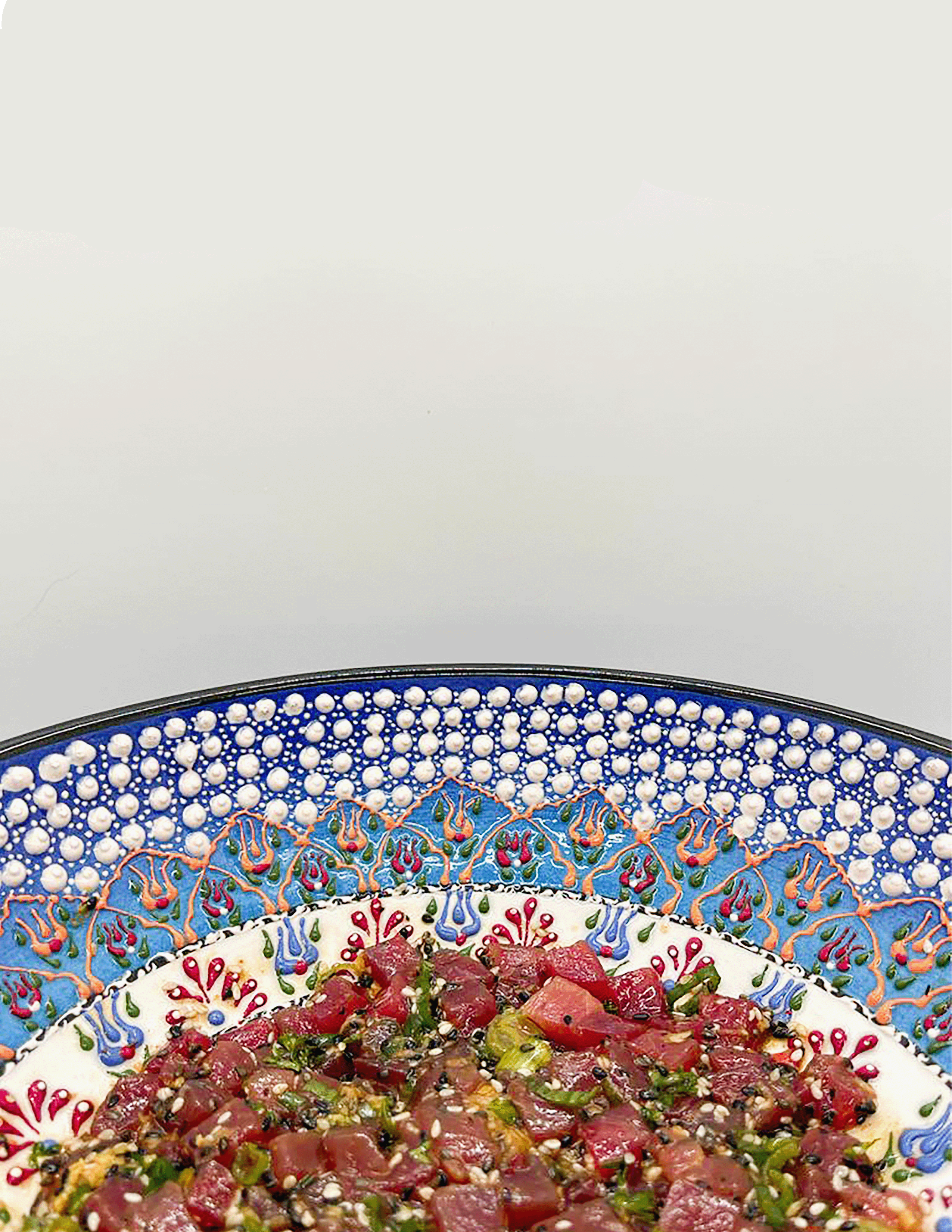
BEFORE AFTER
Now, my image is not only brighter but also leaves me more space for all of my magazine elements!
Step 3: laying out text on indesign
After I finalized my main image, I started to work on InDesign to create my actual magazine. The video below demonstrates part of this creation process! Thankfully, now that I have learned how to use InDesign to make a magazine cover, I can apply this knowledge when creating my table of contents and double-page spread, which will also be made on InDesign.
NOTE: This video only demonstrates the creation of my first variation!
Final Choice

After thoughtful consideration, I have decided to select the first variation of my first cover draft out of the two variations I created. My reasons are as follows:
I like how my four cover lines are all located on the left side of the page, while the bigger, more important cover line is more distinct, being located on the right side of the page. In other words, it is more easily noticeable and draws the most attention!
I like how the font of "The Japan Issue" matches the font of the cover lines. Even though there are several fonts used on this cover, I think they are different enough to create a strong contrast from each other, which I believe is visually appealing and less simple.
I like how unlike the second variation, the main cover line is not spread out against the top of the dish; keeping the words together on the right side of the page is more legible.
Codes and conventions
As I tried to make my cover realistic as possible, it uses several codes and conventions of the cooking, food, and beverage genre. These are demonstrated in the image below!

examples of my magazine using codes and conventions
MASTHEAD: Most cooking, food, and beverage magazines (such as the images below) have small trademark symbols on the bottom of their masthead, hence why I decided to include one as well. Like my magazine, some mastheads are written with more than one color and contain unique icons/illustrations. For instance, similar to how image two's masthead has a spoon, my masthead has a circle that looks like a Japanese flag! Lastly, almost all mastheads are written in a color that heavily stands out against its background and fills the width of the page.


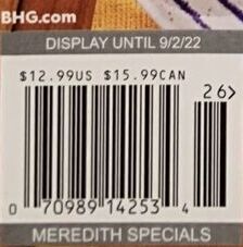
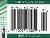
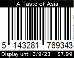
BARCODE: All barcodes display the price of the magazine, which is often written in a small font, making it somewhat unnoticeable. Some even have "display until" dates, hence why I was inspired to include the same. After seeing some magazines that have websites near their magazine, I am considering adding one as well for my final cover.


COVER LINES AND MAIN COVER LINE: To attract more attention, all main cover lines are larger than the normal cover lines and/or vary in typography. They also often relate to the main image—like my magazine—but that's not always the case! Some main cover lines are more general and relate to the magazine's overall theme.


PUFF, PUGS, AND MORE: Most cooking, food, and beverage magazines have puffs that promote a luxury prize—often with high monetary value—in the hopes of attracting a larger target audience. They are written alongside buzzwords (e.g. "WIN" in image #2) to purposely persuade an audience by evoking and appealing to their emotions (pathos). The use of pugs can be used to highlight how many recipes there are in a magazine, demonstrating to the readers whether or not the magazine is worth buying. For instance, if there are a large number of recipes, readers will feel that they're truly getting their money's worth. Lastly, in the cooking, food, and beverage magazines that share recipes from chefs (like my magazine), circular cutouts contain images of the chef (s).


Comments