Cover Design Research
- shiraavidan77
- Feb 26, 2023
- 7 min read
Updated: Apr 6, 2023
So far, I have done extensive magazine research in preparation for designing my final magazine: I have conducted magazine genre research, table of contents research, masthead typography research, and double-page spread research. Yet, one aspect of magazines that I have not fully researched yet are covers! Therefore, after thoughtful consideration, I chose three different design programs that I would be most willing to use for my final magazine cover. Then, I found examples of covers (from multiple genres) created with each program, helping me decide which program(s) I will use to create my own cover.
Program #1: Photoshop
The first program I researched to find magazine covers was Photoshop. Upon research, I found a website, 451 Imaging, a professional Photoshop retouching service that provided numerous examples of magazine covers made in Photoshop. I will definitely use this site as inspiration for my own magazine cover, especially since I love almost all of the covers I saw!

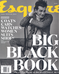
Magazine #1: Harper's bazaar

Upon further research about the magazine, Harper's Bazaar, I discovered that this publication has a distinct house style. For example, its mastheads are always located at the top third of the page and cover a portion of the model. I like how this magazine follows this specific layout as it contributes consistency to the brand. I also like how the color of the masthead matches the cover model's outfit, which creates style and appeal. Plus, I like how the color pink is used, especially since it represents femininity and helps appeal to a larger female target audience. Another aspect of this magazine that I like is the usage of several magazine cover elements. For example, the inclusion of the buzzword "exclusive" makes the cover line stand out more and excites the audience. The phrase "fashion magazine of the year" acts as a unique selling point, which convinced me that this magazine is most likely worth reading and even buying. Lastly, I like how the typography is mainly serif and cursive fonts, making the magazine appear more elegant and aesthetic.
Magazine #2: Glamour

Once originally looking at this magazine, the first element I noticed was the large pink banner, or puff, at the bottom of the page. I like how this element was incorporated on the cover, especially since it promotes valuable, expensive prizes that the target audience would most likely want. Making up for the absence of cover lines, the puff distinctly promotes the magazine content and encourages the readers to buy the magazine. I like how in order to do so, it varies the size, capitalization, or color of the text (typography) according to the prominence of the information. I also like the monochromatic color scheme (consistent use of the color pink), which is used in the masthead, puff, central image/cover model, and unique selling point: it attracts attention and draws interest. Regarding the central image, I like how the cover model is standing in front of a decorative, lit-up number (10) to celebrate and promote its "Special 10th Birthday Issue."
Magazine #3: HGTV Magazine

First of all, I like how this magazine has a diverse color palette, and besides making the magazine appear colorful, it also adds vibrance and creates a joyful tone. Regarding its color scheme, I particularly enjoy how the central image's furniture, paintings, and rug are color-coordinated with each other: the pink "swivel chairs" match the leftmost painting and pink squares in the rug, the yellow leopard pillow matches the uppermost painting and yellow squares in the rug, etc. I also like how buzzwords such as "really fun," "coolest," and "happy" are used to excite the audience. Plus, using a second-person point of view and giving the readers commands (see the leftmost painting's caption) establishes a connection with the target audience. The phrase "can't go wrong with..." creates a similar effect.
Other Photoshop magazines I like:


Pros v.s. cons
PROS of Using Photoshop to Create Cover | CONS of Using Photoshop to Create Cover |
• Relatively familiar with its tools already and want to learn even more! • Can easily edit and enhance photos through the following: altering color balance, contrast, and brightness; removing blemishes from images; combining multiple images into one image (composite images); and cropping and straightening images • Useful for one-page documents (like magazine covers) • Can use as a start-up to edit a specific image and then transfer work onto another program like InDesign or Illustrator for finishing touches • Have found many online tutorials | • Not as good for image CREATION (better for image EDITING) • Loses quality once resized (becomes pixelated once enlarged) • Not good for large amounts of text (won't be beneficial for cover lines) |
Program #2: Adobe InDesign
After researching Photoshop magazine covers, I decided to find examples from Adobe InDesign. In order to do this, I found a website, Envato Elements, which allowed me to search for dozens of magazines from almost every genre. As shown in the image below, I simply typed "magazine" in the search box and filtered out the results to only show covers that were designed on InDesign. The same website also provided tutorials on how to make magazine covers, which I used to find one of my images.

Magazine #1: Quest Magazine

One aspect of this magazine that I like is the masthead, "Quest," as it effectively summarizes what this magazine is about—traveling/going on a "quest." I also like the cover lines' wording, especially the main cover line towards the bottom third of the cover. In fact, since "Oh, the places you'll go" is most likely a quote everyone knows, the target audience can easily tell that this is a travel magazine. Plus, buzzwords such as "beautiful," "refresh," and "amazing" adds excitement: the target audience may find additional value in this magazine since it sounds luxurious. Similarly, I also like the inclusion of the puff since it would convince the target audience (including myself) to buy the magazine.
Magazine #2: Sport Magazine

I like this magazine since it uses several stylistic features that are easily noticeable. For example, I think the use of a yellow cut-out to highlight the cover lines is unique, especially since I have never seen it on any magazine cover before. It is also helpful since it effectively points the cover lines out and makes them more obvious. I like the use of shapes as well since they are more visually appealing and decorative than plain text. Overall, with all of the stylistic features and elements, this magazine is not minimalistic: the cover has an "over-the-top," extravagant design, which I like. In other words, I like how this cover is not simple and instead heavily concentrates on shapes, colors, and patterns to avoid white space. Lastly, I think the designer of this cover chose a perfect color scheme of red, black, white, and yellow since these colors are strong and powerful (relating to the theme of sports).
Magazine #3: Explore

This magazine cover came from an Envato Elements tutorial. I like how the masthead is spread out against the left side of the cover rather than being typed horizontally like most mastheads. Therefore, I think the unique choice of this masthead layout makes the magazine professional and decorative. Plus, as the masthead is not easily legible at first glance, the audience would most likely attempt to decipher the letters, easily attracting their attention. I also like the color scheme of yellow and white—colors that pop out from the plain black background. Overall, I think this magazine was designed with a very unique layout!
Other Adobe InDesign Magazines I like:


Pros v.s. cons
PROS of Using Adobe InDesign to Create Cover | CONS of Using Adobe InDesign to Create Cover |
• Useful for large amounts of text • Have found online tutorials • Great quality • Have never used this program before and want to challenge myself by learning something new • Can be used in parallel to other programs (such as Photoshop and Illustrator) to finalize layouts • Advised to create magazines on this program • Has precise grids and guides for page and text layout • Has professional typesetting features to consistently format text across multiple pages (can also be beneficial for double-page spread) | • More useful for double-page spreads—multi-page, text-heavy documents—due to it having page numbering and better text layout • Not helpful for editing images like Photoshop |
Program #3: Adobe Express
After researching Photoshop and InDesign, I decided to research Adobe Express, a software I never heard about before my research. On its website, I was able to find a variety of magazine covers that I liked.

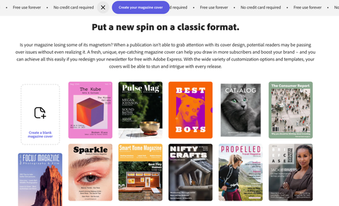


I scrolled through these articles to pick the three magazines I liked the most.
Magazine #1: Bound

I like this magazine cover primarily for its distinct color scheme and how it relies heavily on only two colors—pink and white. Therefore, the model's pink hair and makeup match the background and barcode, creating a visually appealing style. Plus, I believe that the colors pink and white both contrast each other nicely: as a versatile color, the use of pink provides vibrance to the cover, while the use of white provides simplicity. Regarding typography, I like how a futuristic-like font is used in the coverlines and issue date, contributing to the modern theme. I also like the masthead's typography: it is sized as large as possible, written in bold, and capitalized, allowing it to stand out more than any other element. I like how the text is consistently written in white, making the magazine appear uniform. Overall, I think this is a very pretty cover that can easily capture the attention of its target audience!
Magazine #2: Ruffled

I like how this magazine edited its cover image to have multiple tints, complimenting the photography and enhancing the magazine's overall appearance. This aspect of the magazine quickly caught my attention, especially since the colors are vibrant. I also like how the amount of text is kept to a minimum since it allows the audience to pay more attention to the cover image rather than the cover lines. I think this was a good choice since it makes the magazine appear less wordy and more easily legible. Therefore, this cover's appropriate color scheme and layout allow it to appear decorative and captivating.
Magazine #3: Sprout Vegan Magazine

Out of all of the magazine covers I found on Adobe Express, this one is formatted the most like a true magazine. Unlike the previous two examples, this cover includes a banner, a main cover line, and decorative shapes—elements that most magazines use. I also like the distinct, simple color scheme of purple and yellow, which contrasts and pops out against the cover image.
Other Adobe Express covers I like:


Pros v.s. cons
PROS of Using Adobe Express to Create Cover | CONS of Using Adobe Express to Create Cover |
• Can quickly create designs • Much more user-friendly and easy to navigate than any other Adobe program • Contains free icons, backgrounds, graphics, shapes, fonts, etc. • Can get inspired by numerous templates • Combines similar tools from Photoshop, Illustrator, and InDesign • Have never used this program before and want to learn something new | • Limited toolbar (e.g. can't edit out flaws like Photoshop) • Not as interested in using this program • Less advanced than other Adobe programs |
Which programs will I use for my cover?
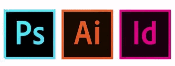


Adobe apps are designed to work together...that's why I would like to use not one, but three for my magazine cover (Photoshop, InDesign, and Illustrator). However, if—at any time in the process—I encounter some difficulties, I can simply use Adobe Express to design my cover instead since it is a more user-friendly and easier-to-navigate tool, as previously stated. Below is the plan that I will potentially follow for creating my magazine cover.

Essentially, I decided to select all of these programs because I found out upon further research that with their own strengths and weaknesses, Adobe apps are all relatively different from each other. That being said, they each have different purposes and even though they may look similar, these softwares are used for completely different effects when creating digital media. More specifically...
Photoshop is used for enhancing and retouching photos through raster art (based on pixels), unlike Illustrator which uses vector art (based on mathematical equations) for making logos, icons, graphics, etc.
InDesign, however, deals with multi-page projects with large amounts of text, including magazines, newspapers, and presentations.
With this in mind, as stated in the previous three steps, Illustrator can be used for my masthead, Photoshop can be used for enhancing my central image, and lastly, InDesign can be used to format the textual magazine elements. Adobe Express can be used as a backup plan!


Comments